Preface
I decided to start this blog post detailing the development of the new GUI after about 9 months of working on it so most of the post is me recollecting decisions I made earlier rather than writing what I’ve been doing as it happens. Because of that, this blog is quite long so I apologise for that. Nothing in this blog post is final and any part of it is likely to change in the future.
Xenia is an experimental Xbox 360 emulator that has been in development for quite a few years now. Over the last few years progress has been made in every department, from a new D3D12 renderer being created to an ever increasing kernel implementation. The one area that has barely changed however is Xenia’s user interface. That has, for the most part, stayed the same.
Why a new interface?
Xenia started off having no GUI at all. Users were expected to either run the executable from the command line or drag an xbox 360 game onto it from the file explorer. It wasn’t until 2015 that the main window was even shown on launch.
Since then the interface of xenia has remained mostly unchanged. Support for DPI-aware scaling was added, and a new logo was created but those are the only major changes the interface has seen. This interface is perfectly adequate allowing users to select their games through a file dialog and providing very basic configuration through the menu bar, but apart from that it is extremely barebones.
Although this basic interface has served the emulator well for over 4 years now, I believe it is now the right time to create a new, and much more advanced UI. Exciting things are happening with Xenia right now, such as the previously-mentioned D3D12 backend (and maybe even a new Vulkan backend too 👀).

Blueprinting a new interface
When I first decided to create a new GUI for Xenia I had a few vague ideas for the design I wanted to create. I decided to install Figma, a graphics design program, and begin prototyping designs.
Design 1 - Going Dark
Right from the start I knew I wanted the new GUI to be dark, or at least have a dark theme. The first prototype I made involved creating a dark version of the current interface to get a feel for things.
This was nothing special but it gave me many ideas for what to design next. It just so happened that I have a friend who is a professional graphics designer so I asked her to help me create an initial design.
Design 2 - Sidebar
Me and my friend came to the conclusion that the interface would benefit from a sidebar, so we set to work on creating a prototype design that featured one. After a weekend of messing with colors and icons in Figma we had our first shell.

I spent most of this weekend figuring out how to use Figma properly as before this project I’d never designed anything before. I was feeling completely out of my depth here so was very glad to have a friend who knew what she was doing. As you can see this is a very barebones design so over the next week or so we added more to the design, the biggest being a new library interface.
I’d quickly like to take a detour into some alternative designs made by my very skilled friend. Although these designs were never used I feel like they deserve recognition anyway.
I ultimately decided against using these designs for two reasons.
- I felt like these designs were too complex for me to accurately recreate using Qt, especially because I’d never used the library before.
- I felt the design, although looking very professional, would be suited better as a website design than a desktop program design.
From Design to Code
After this design was created, I decided to try and implement it in code. First though, I had to choose a GUI framework to use.
I had two ideas in mind for what framework to use for the GUI. Option #1 was to use Qt and C++. Option #2 was to use WPF and C#. Each framework had pros and cons
| Qt | WPF |
|---|---|
| + Qt is C++ meaning it is much easier to integrate a Qt-based UI into the existing C++ application. | + WPF and XAML allow for creating extremely rich interfaces in little code. They are also much easier to work with than the now ageing Qt widgets library. |
| + Qt is cross-platform. This allows any UI created with it to work across operating systems with little or no work. | + C# and WPF have a very large selection of 3rd-party libraries and interface controls. This is an area that Qt falls short in. |
| - Qt can be difficult to work with. Especially the Widgets library as it is old and has to support legacy codebases. Qt created QML as a solution to this. | - WPF isn’t cross-platform. That means any UI created with WPF would only work on Windows. While C# itself is cross-platform, there’s no cross-platform C# interface libraries that have the level of maturity that I would like. |
| - As WPF relies on C# it would introduce a lot of new dependencies to the Xenia project, making it bulkier. Meanwhile Xenia aims to be as lightweight as possible. |
In the end decided in favor of Qt. This was an easy decision in reality as the very first bullet point in favor of Qt outweighed the rest. The fact that Qt can be easily integrated into the main Xenia codebase is all that mattered.
I decided to familiarize myself with the Qt library by converting a previous design into a coded application. This took a little longer than I’d hoped as I’d never used Qt before and wasn’t used to its quirks (and bugs), but this was the result:
You may notice that the iconography and theme is slightly different than the design it’s based from. This was an intentional change, switching from Ionicons to Segoe MDL2 Assets. This change was made as I wanted the new UI to have a more “Xbox/Microsoft” feel and what better way to achieve that than to use Microsoft’s own icons?
On the subject of the GUI having an “Xbox/Microsoft” feel, I decided to try switching the sidebar out for a top-positioned navbar, taking inspiration from the Metro and Fluent design languages. This sparked a friendly debate in the Xenia discord about sidebar vs navbar which even managed to make it onto Reddit! The results weren’t conclusive, so I decided to ignore them and worked on redesigning the GUI with a top navbar. This would eventually become the final design.

Components of a GUI
Finally, after a lot of backstory I can now go into details about the creation of the GUI. Let’s start by listing all of the components that I feel are a necessity for the GUI to be of a high enough quality.
- Easy to configure settings for the emulator
- Able to control the entire app with a gamepad, not just games
- Have a sleek interface that is also themeable
- Support all operating systems that xenia is designed to run on (Windows and soon Linux)
As of when this article was written I’m only 1 for 4 on this checklist. The current UI can be themed but there are no settings or gamepad support yet. Additionally, although Qt is cross-platform I haven’t yet tested the UI on Linux. Just based off of this checklist it appears not much progress has been made, but that isn’t the case at all. Let’s take a look at the progress that has been made up until this point.
- Designs and ideas for the new UI, including
- What screens should be in the app and how they should be laid out
- The designs of various components
- A prototype that provides basic navigation around the designs
- A UI that’s highly-customizable and sleek that’s based on the prototype designs
- Includes custom variants of all common interface controls
- A (mostly) functioning game scanner and library
We’ll take a closer look at the designs first.
Designs
The designs I’ve made for the new GUI are the furthest to completion out of the previous bullet points. They were created in the Figma design tool as Figma allows for easy collaboration with others. Let’s start with the Home screen.
Home
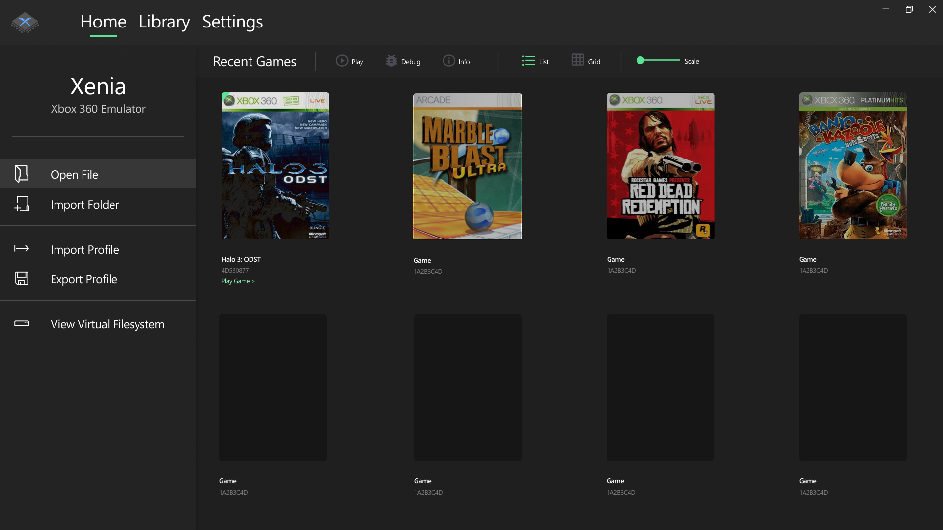
Walking through the main components of this design we’ll start with the sidebar. I decided on a sidebar for this screen to host the most common actions users may do such as opening a game, improving the usability of the app. You may notice a slight difference between the sidebars in the two images. They have slightly different actions on them. This is because I haven’t fully decided on what actions to incorporate into the sidebar, and probably won’t be fully committed to any until the UI is nearer completion. The sidebar is designed using inspiration from sidebars that exist on the Xbox One, which are built using Microsoft’s Metro/Fluent design languages. This is a trend you’ll see throughout the designs.
Next to the sidebar is a list of recently opened games. I plan to allow the user to choose between a grid view and table view for any game lists but as of right now I have only coded the table view, the grid view remains just a concept for now. As you will soon see, this part of the “Home” tab is very similar to the “Library” tab. I would like to add more information to the home tab to distinguish it more but I haven’t yet come up with any ideas or designs. If you have any ideas I’d be happy to hear them.
Finally, you can see a design of a toast notification that could be used to show achievement messages and other things. Like the grid view, toast notifications are purely a concept at this stage.
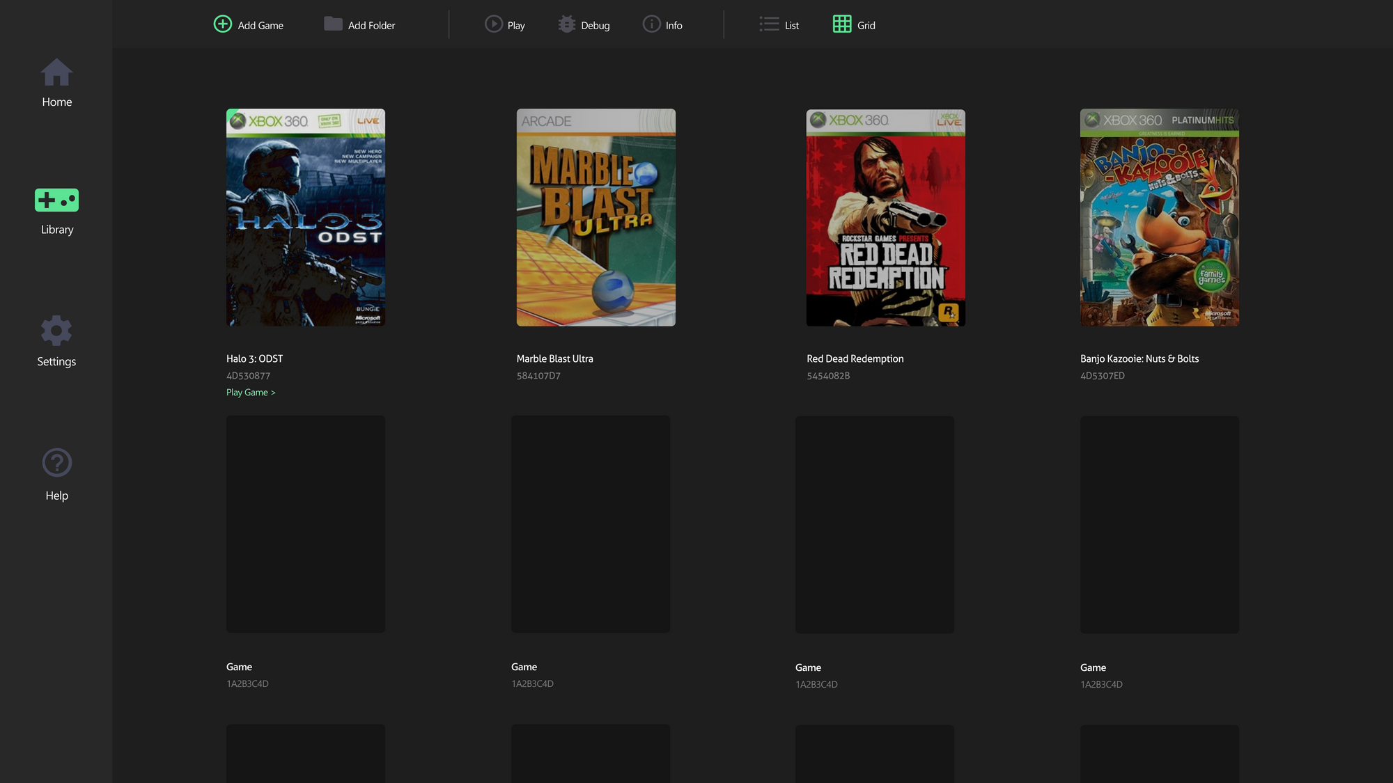
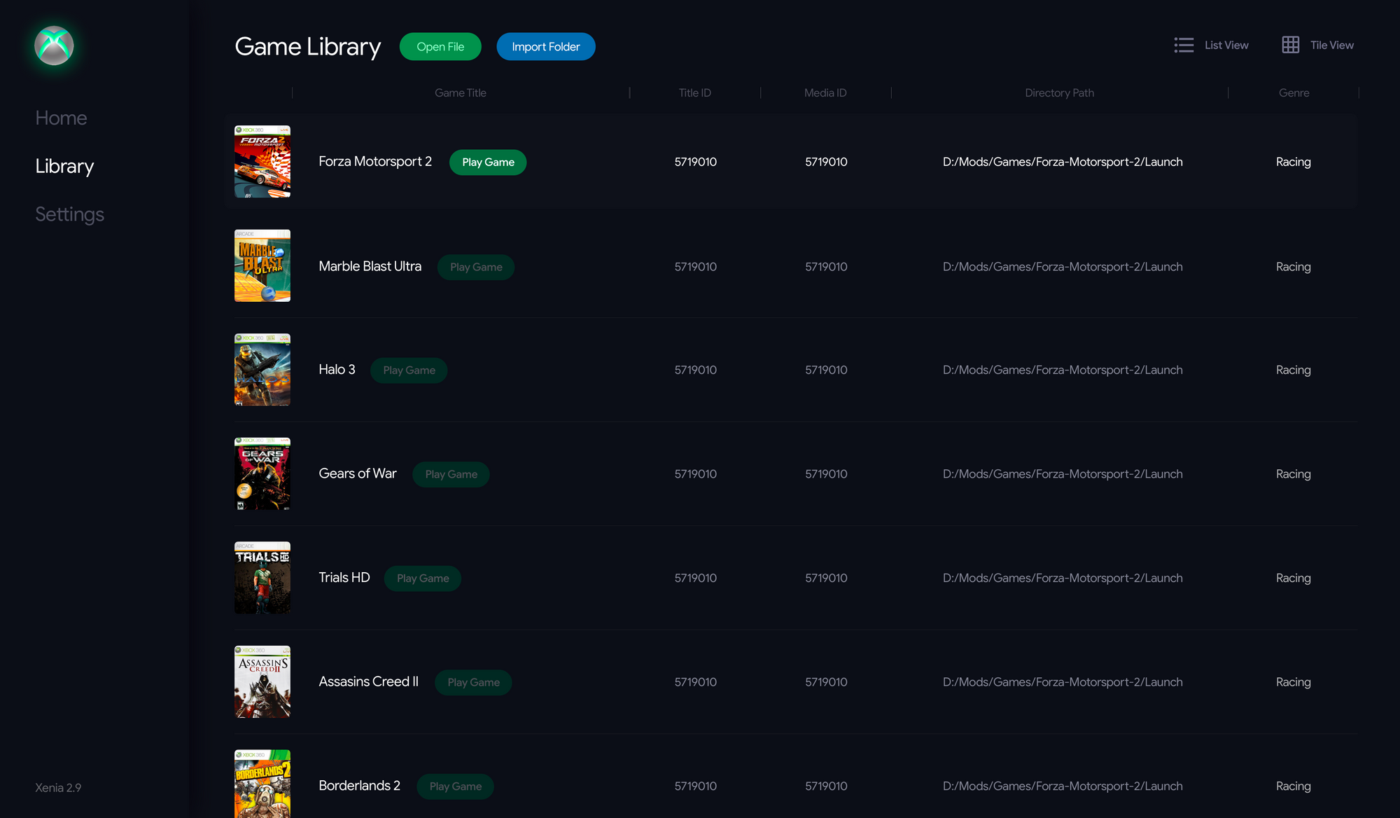
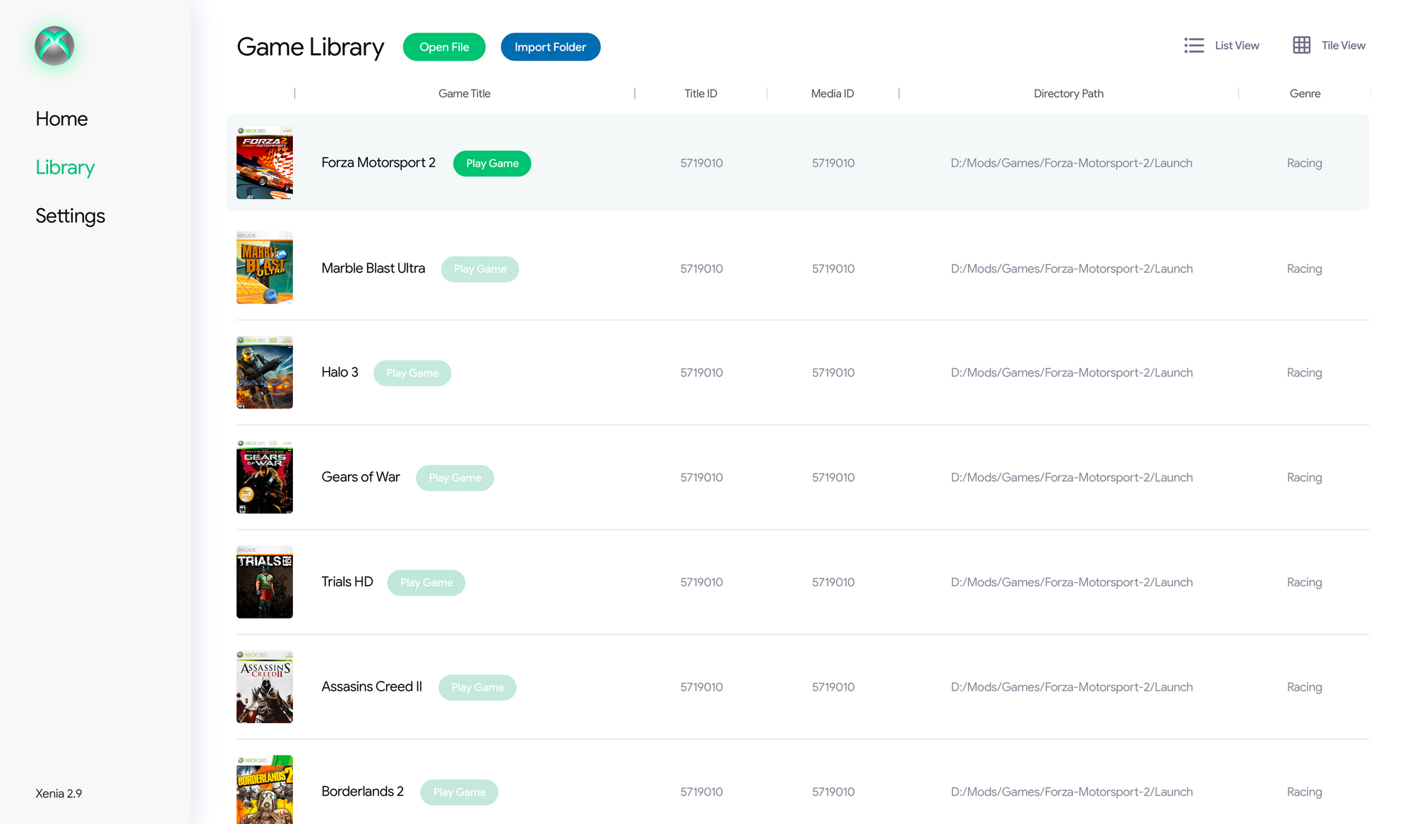
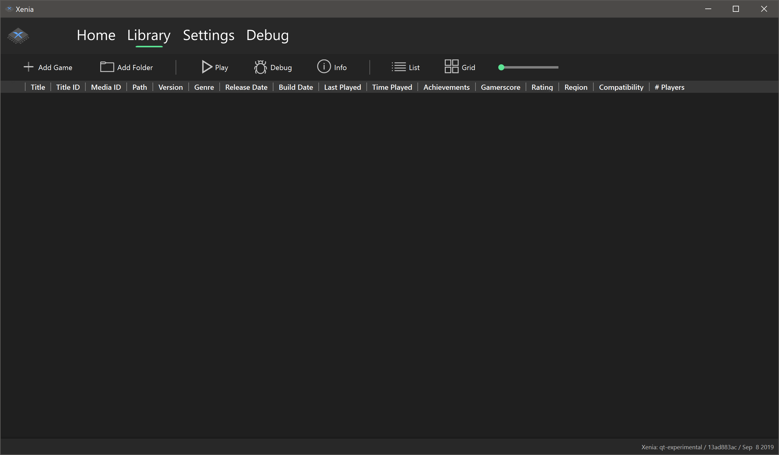
Library
Left to right: Library view (table), Library view (grid), Game Details view (rich), Game Details view (basic)

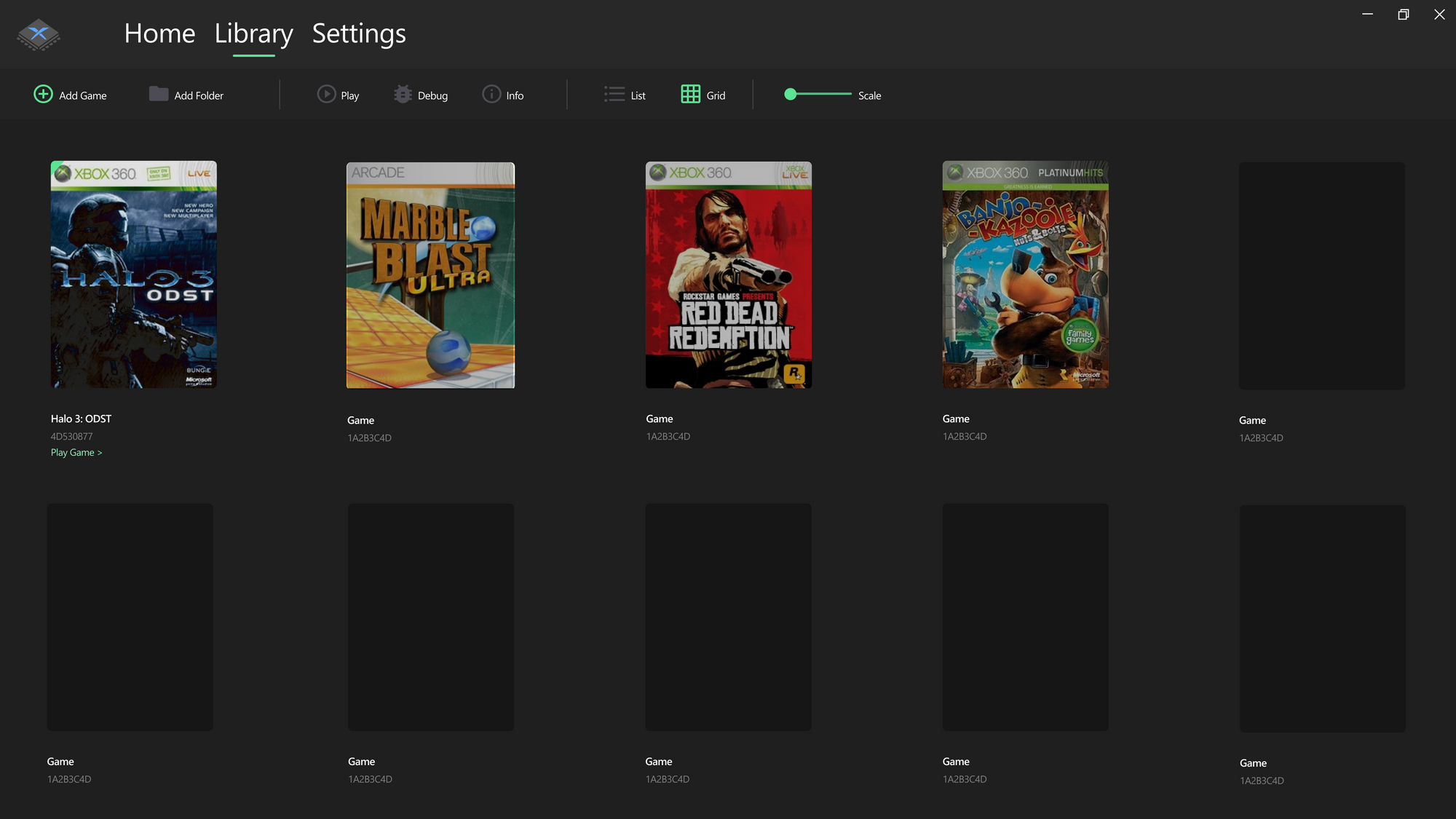
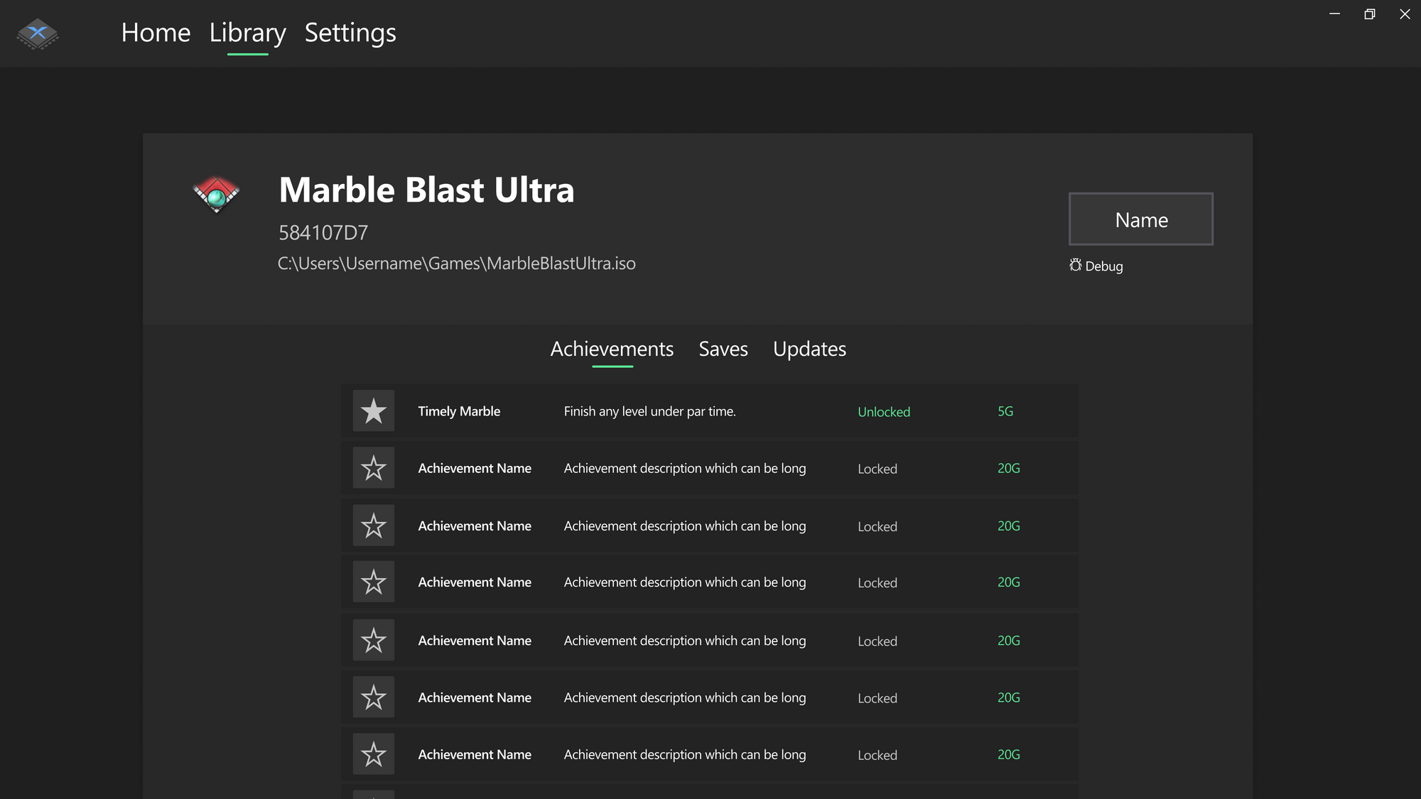
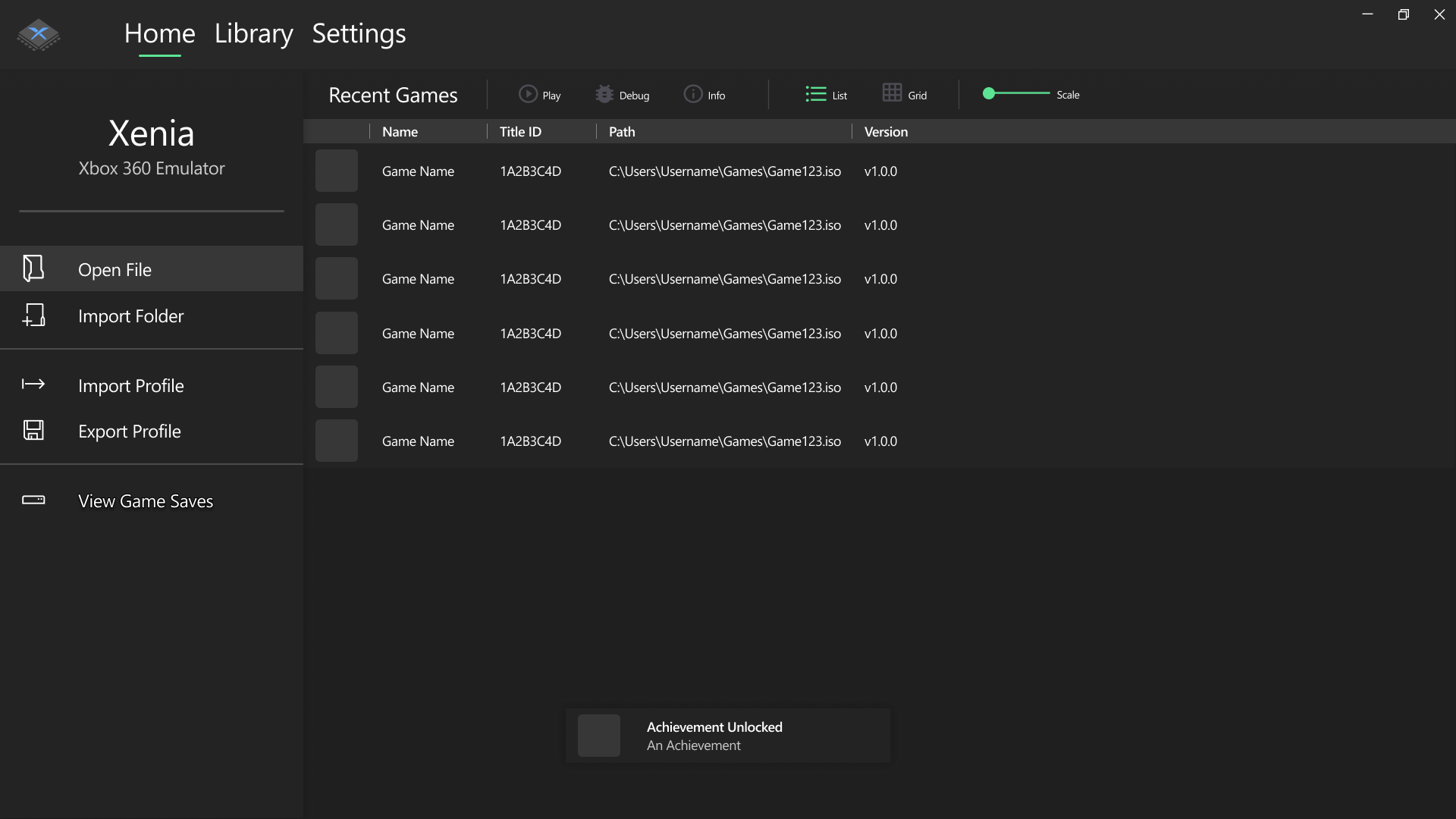
Above are four designs that represent two parts of the “Library” tab. The first two pictures show the main game library view. This area contains a list of every game the user has scanned/opened. Like the home tab, I have designed both a grid and a table version of this section, hopefully allowing the user to choose which one they prefer more. I have only coded the table version so far however. The table view has a wide variety of columns including name, title id, path, version etc. These columns can be hidden if the user desires. Above the game list is a toolbar containing useful actions such as adding a new game to the library or playing an existing one. Not shown in the design is the context menu that will show if right clicking on a game. I plan for this context menu to provide at least the following options (and maybe more): “Play game”, “Debug game”, “View game info”, “Remove game from library”.
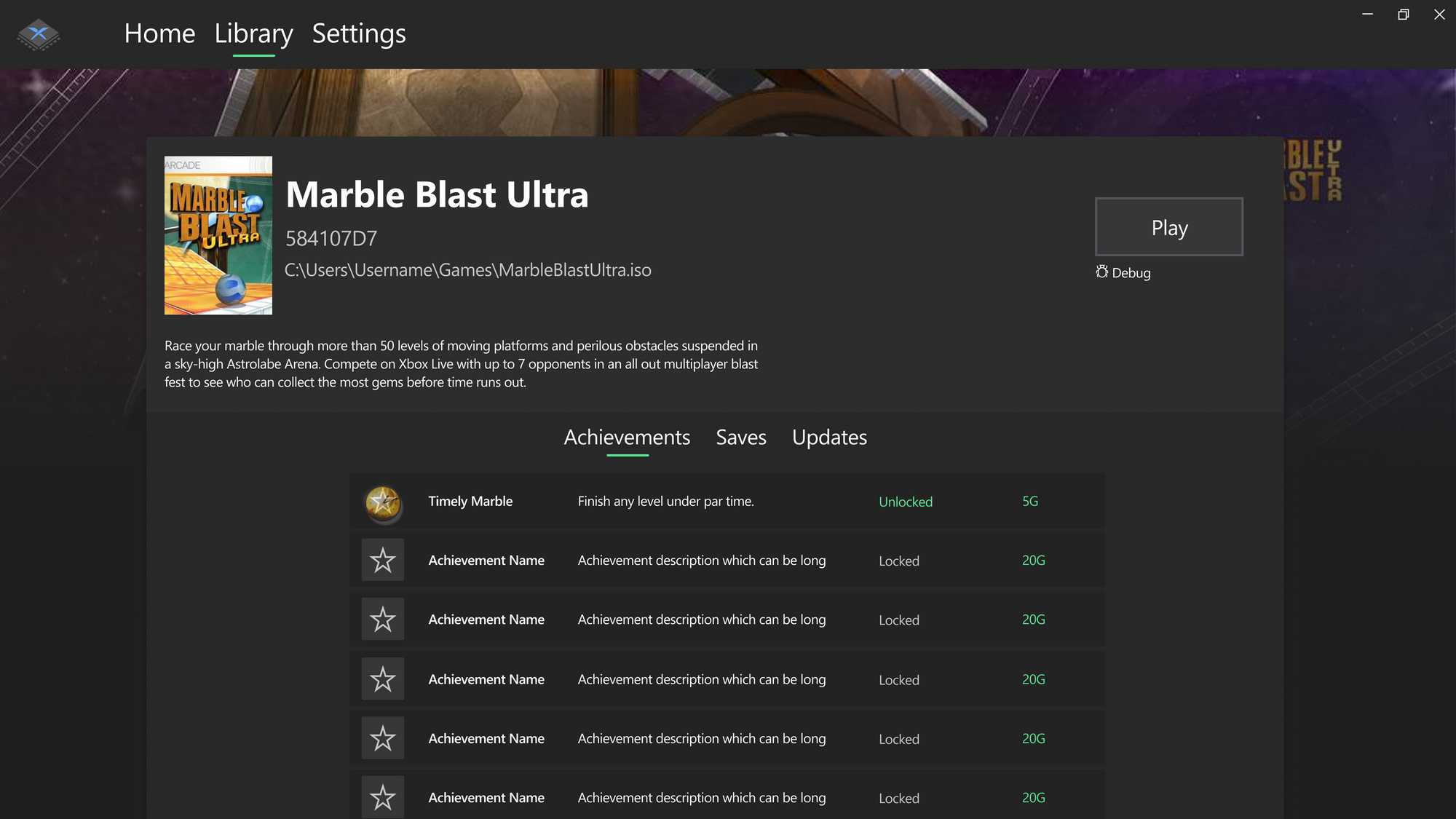
The other part of the Library tab consists of a view that shows details about a specific game. As shown above, this view is split into 2 sections. The top section shows details about the game itself, including game title, title ID and path. Also in this section is a play button to launch the game. This was inspired by the Microsoft store layout. The lower section contains a tabbed interface for extra information relating to the game, such as achievements and saves. The achievements tab will list the achievements for the game, as well as their status (unlocked/locked) for the current main user profile, with the saves tab showing savegames for the current user. The Updates tab will allow the user to manager/add title updates for the game. None of this functionality has been coded yet and is all hypothetical at this point. This game details interface may not make it into the first few releases of the UI as it relies on some as of yet unimplemented code in the main xenia codebase, such as full gamer profile support.
There are two different designs for this Game Info view. A “rich” version and a “basic” version. The rich version contains more information and images then the basic one, such as box art, a background image, game description etc. This is because this data is not available from the game itself but must be pulled from Xbox Live. Therefore, I plan to give the user an option to allow connecting to an external API if they choose to pull this information. If they opt not to then the basic version will be shown instead.
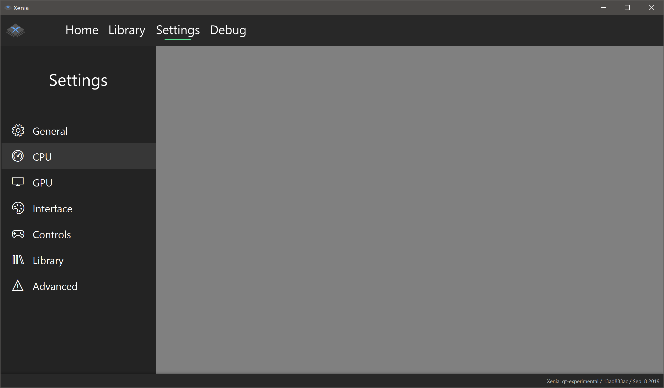
Settings
Settings views: General, CPU, GPU, Interface, Library, Controls (not shown: advanced view)
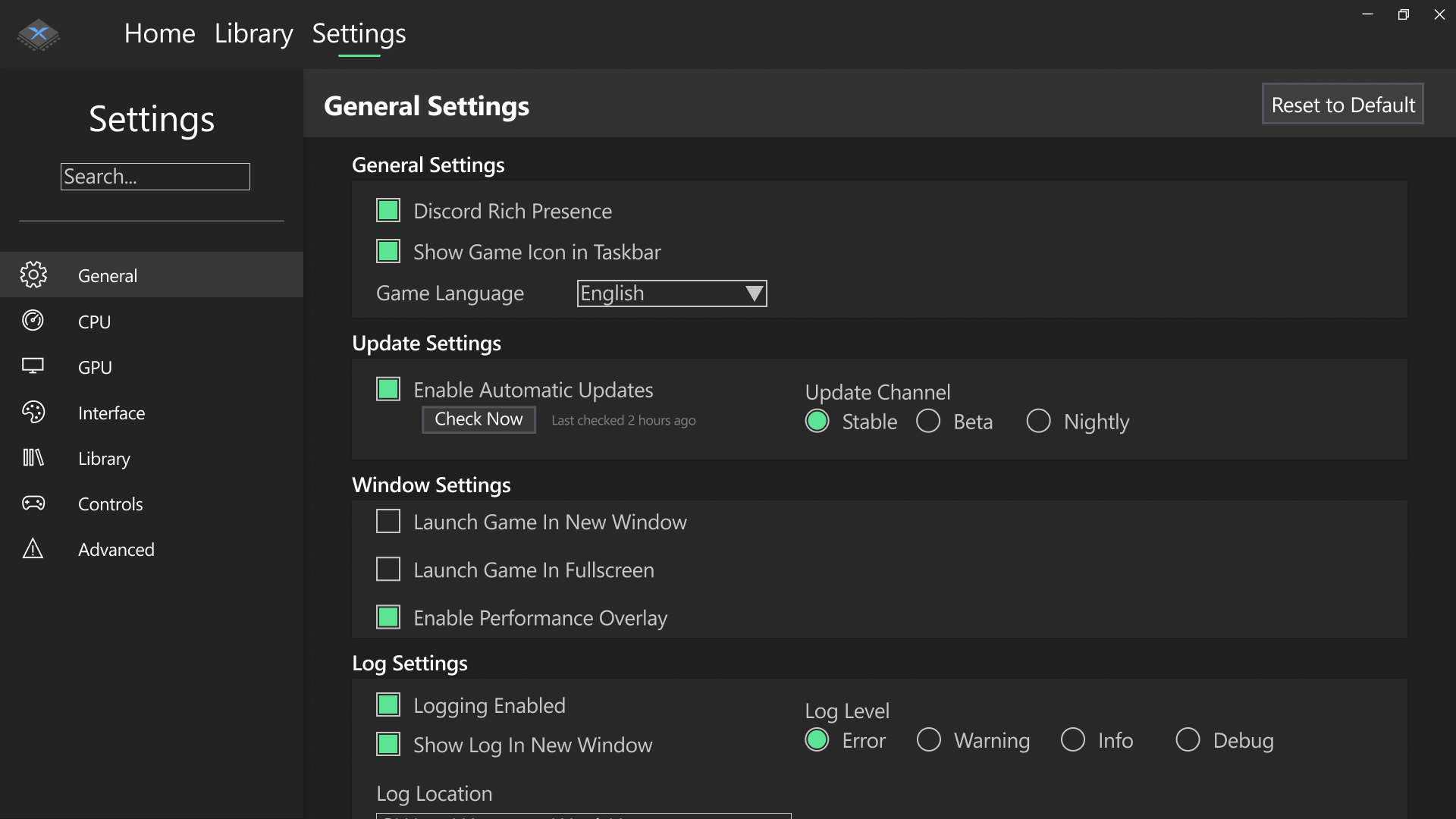
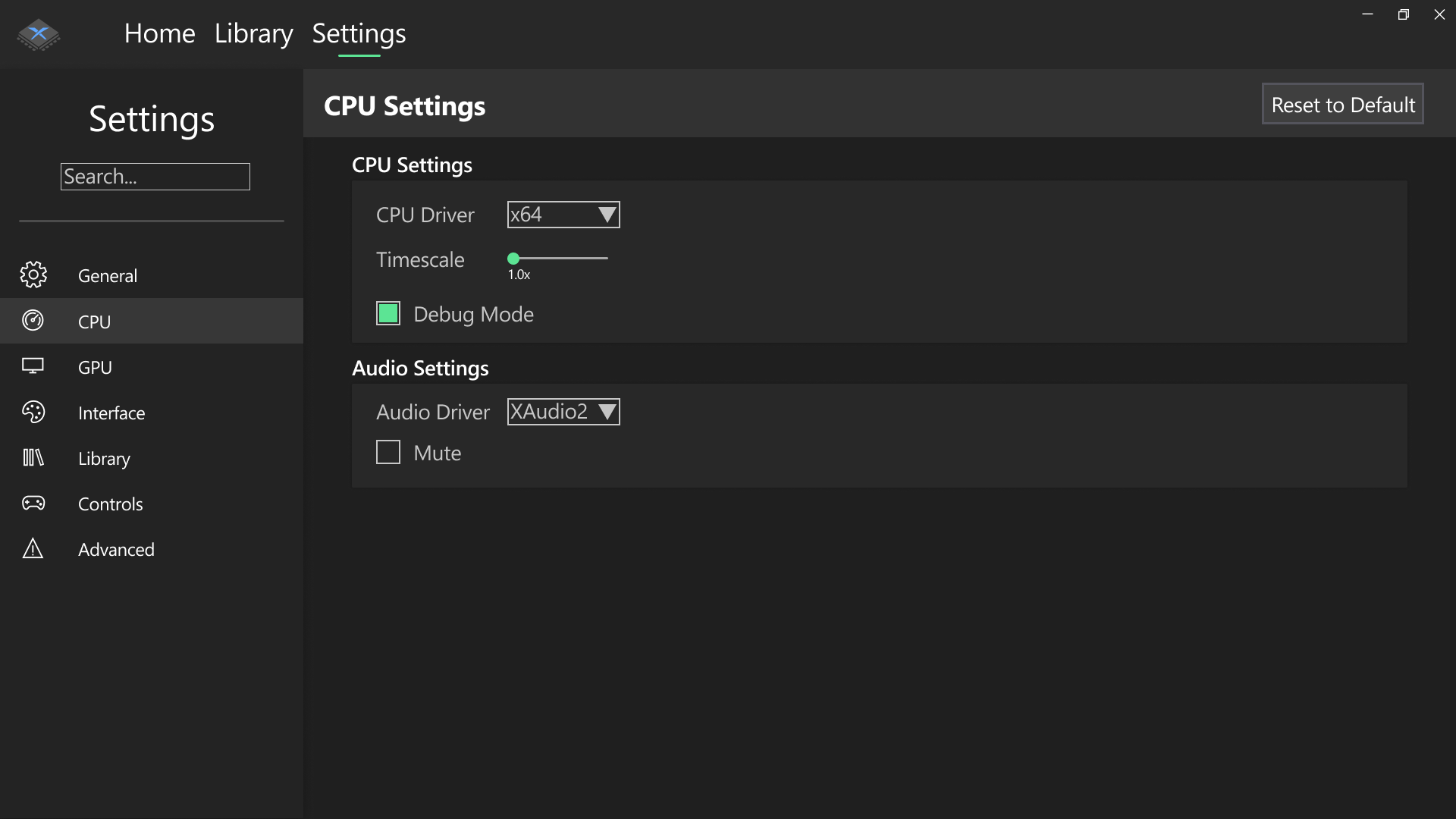
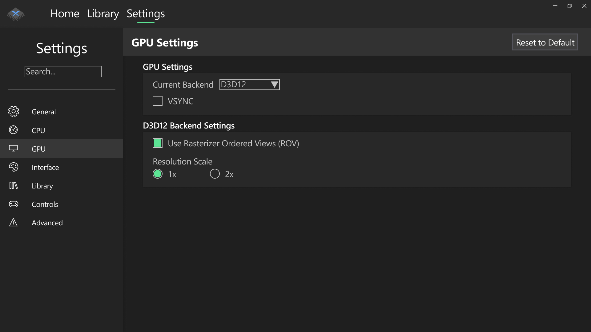
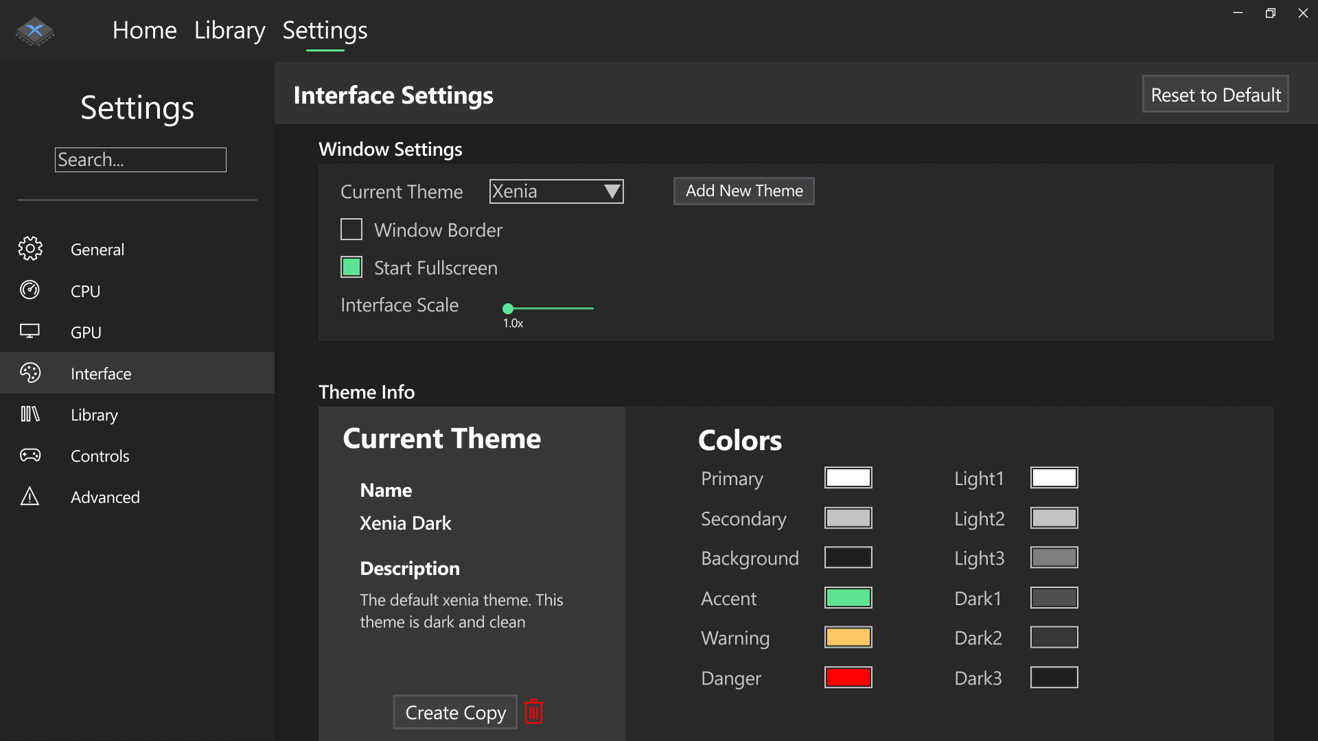
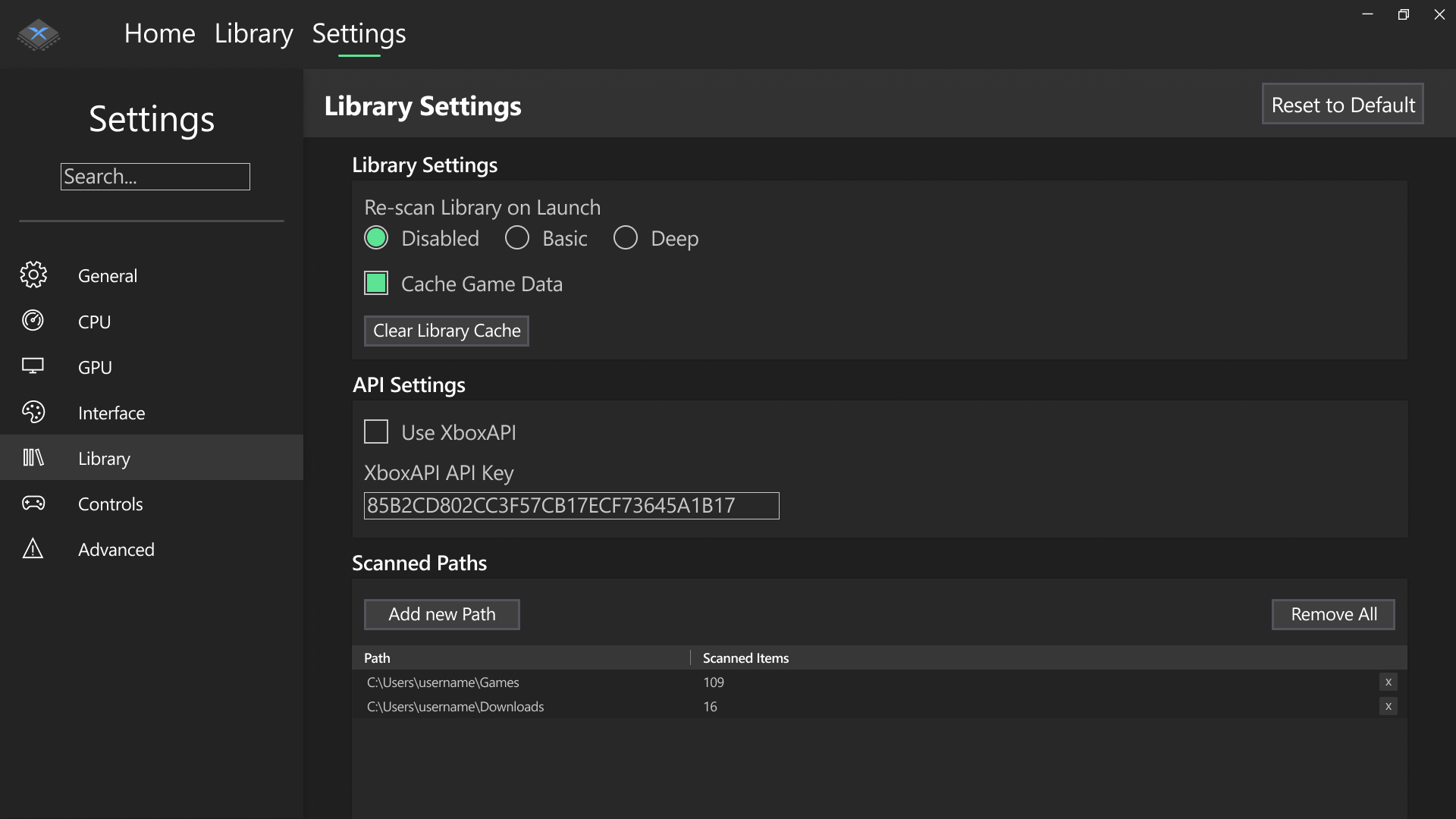
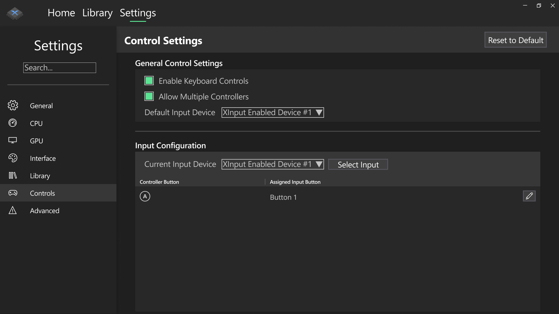
The settings tab is the most incomplete tab as of right now. I have designed most of the different settings views but nothing is finalized yet, and there is no settings implementation at all in the actual code yet, unlike the other two tabs. Settings have been categorized into the following sections: General, CPU, GPU, Interface, Library, Controls and Advanced. These roughly match the same sections found in the config file introduced recently. In fact, the settings interface above will just set these config values behind the scenes.
It’s worth clarifying that the settings tab and all its content is still WIP. Things are subject to change in the future as this is the part of the GUI I’m most heavily working on right now (along with game scanning). Please don’t treat the above designs as final. In fact, if you have any improvements you can think of, please let me know!
There’s not much to discuss about the settings views as the images show exactly what needs to be said. I’ll quickly run over the layout however. The settings tab has a sidebar similar to the home tab, which contains a way to navigate through the different settings sections. In each section there is a top “toolbar” of sorts, containing a title and a reset button. The rest of the tab contains the view for that specific section, which can vary depending on which section it is. Most section views consist of groupboxes containing relevant settings toggles.
Current GUI Status
Now I’ve shown you the designs I created for the new GUI, let’s take a look at the actual progress so far. I’ve demoed most of the current progress in this handy 1 minute video so if you don’t want to read the details you can just watch it below.
Let’s start by talking about the app in general. The default theme, like the designs, is a dark theme with green accents (although the accent color may change in the future). The app has custom scroll bars that fit the theme better. The app is also completely themeable, a fact that we’ll get to later.
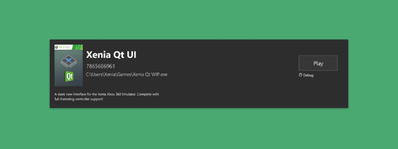
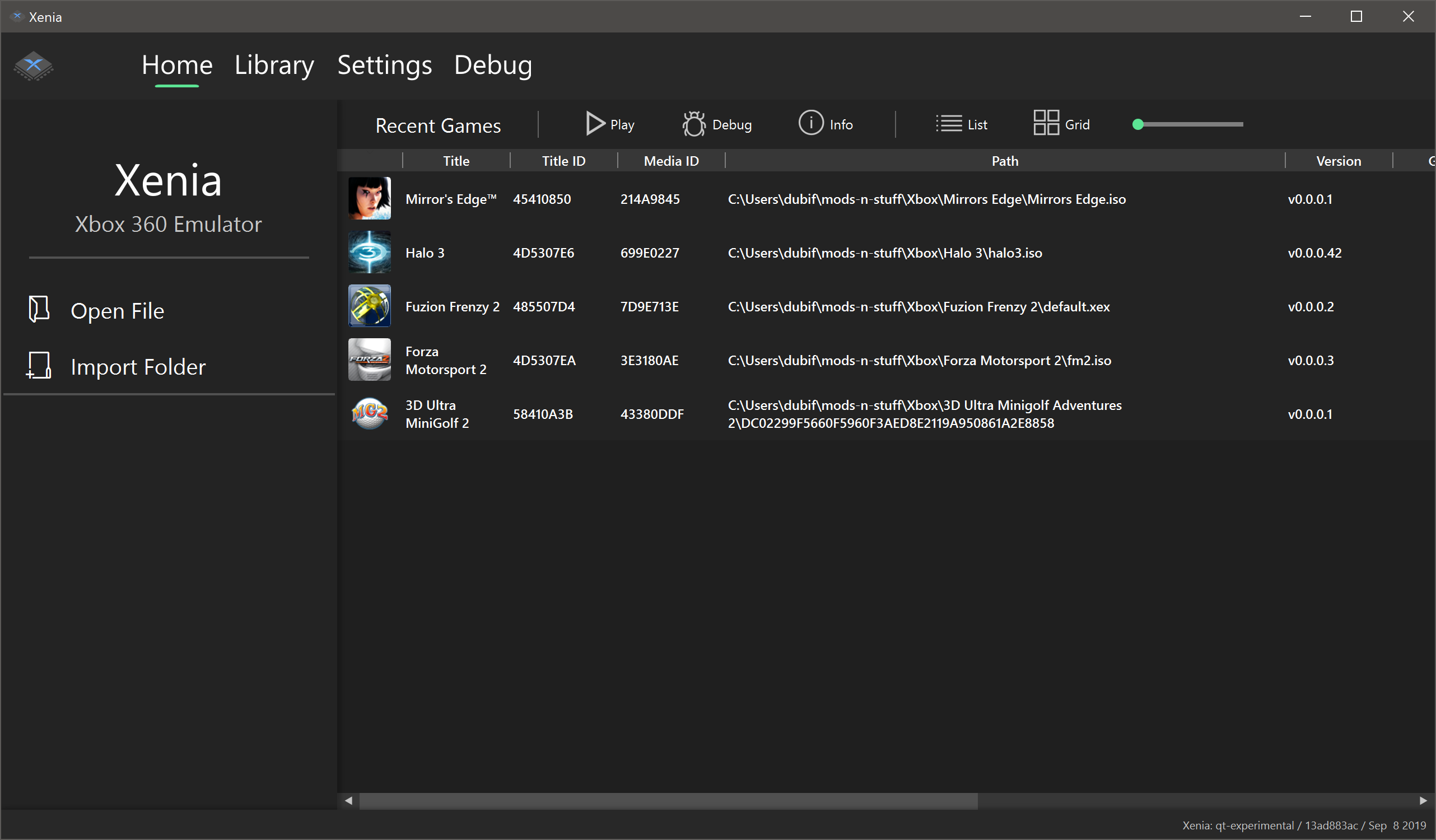
First of the tabs is the Home tab. Features that have been implemented so far include working Open Game and Import Folder buttons and a working library view. This library view is meant to only show recently played games but for testing purposes it shows the whole game library right now. For the recent games list to work, a cache file/files is needed to store game information (including date last launched) which isn’t yet implemented. The play button in the home tab is currently somewhat functional as it is linked up to some proof-of-concept code created by DrChat to run games using the vulkan renderer from a Qt window. This code is old but can be found here. A lot of work is still required in the graphics department to make Qt play nicely with xenia’s D3D12 renderer (and the new vulkan v2 renderer when finished).
The Library tab isn’t currently linked up to anything, but theoretically the same table view from the Home tab can be displayed here with basically no amount of work.
The Settings tab is also quite bare so far, showing only a sidebar and placeholder views for each settings panel. This tab is the one I’m most actively working on as of this article.
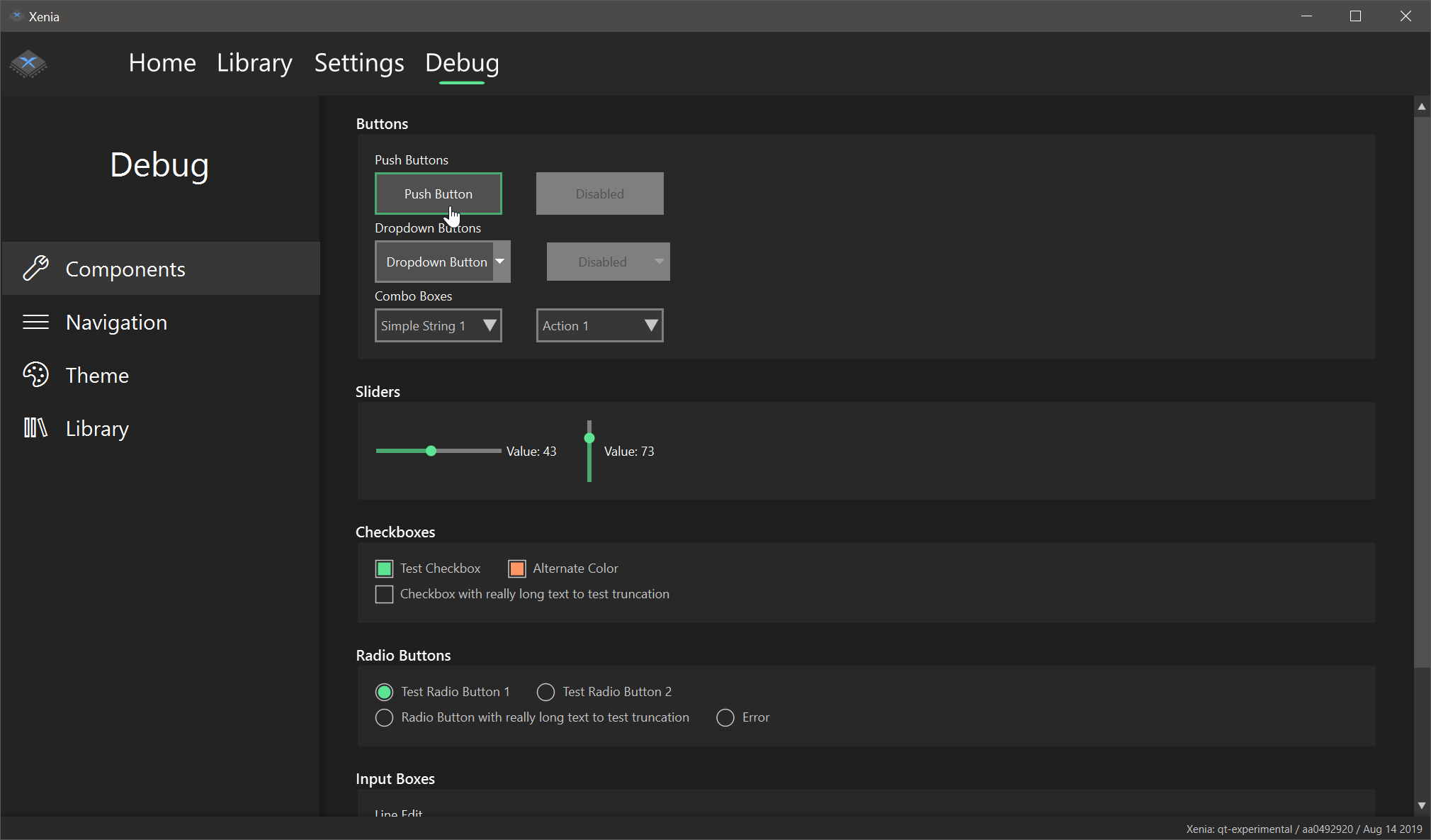
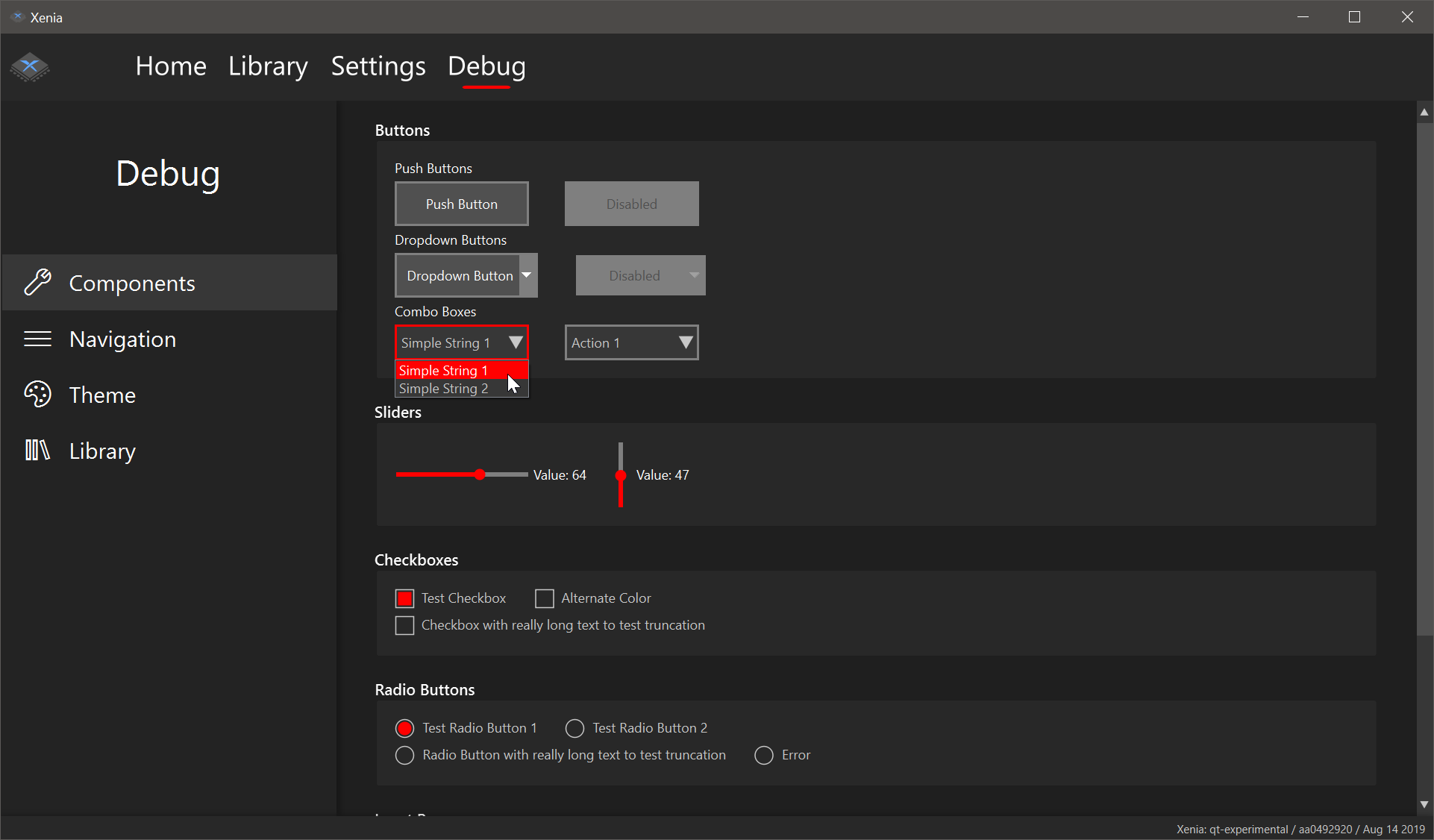
The Debug tab, one that didn’t exist in the prototype designs, is where the most work has been done so far. I use this tab as a sandbox of sorts to test the custom-designed components that will be used elsewhere in the emulator. This tab is designed to look like the Settings tab so much of the code here can be ported to the Settings tab too.
Theme support
The new GUI can be easily themed by users. There are two ways to create themes. Both involve creating a theme package, which consists of a theme.json and optional CSS files in a stylesheets subfolder. Each stylesheet named after the component it’s for will be automatically loaded by the program. Xenia will search for themes in a “themes” subfolder from the main executable. A more comprehensive theming guide will be available when the new UI is ready.
The structure of a typical theme is as follows: Theme-root/ ├── stylesheets/ │ ├── MainWindow.css │ └── XPushButton.css └── theme.json
The easier way to make small theming adjustments however is to edit the theme.json of the theme. The theme.json contains a list of color values which can be edited. Here is the theme.json for the default UI theme:
|
|
If we were to edit the secondary value to #FF0000 (pure red) the UI would look like this:
Final Thoughts
I hope this showcase of the new Xenia UI has been interesting. Although it’s not finished yet, I’m glad that my work is starting to take shape into something great. You can view my fork of Xenia here. Please feel free to join the Xenia Discord to give me suggestions for the new UI, and to talk Xenia in general, and don’t forget to share this article with your friends (and enemies)! I’ll leave you with an unofficial roadmap of what I plan to do next.
Things to do before first beta:
- implement settings panel using xenia’s new config system
- add support for the new D3D12 backend to actually support launching games
- allow the whole UI to be navigated just by controller (required by the main xenia devs before they’d consider merging it)
- implement a library cache so games don’t need to be rescanned every launch, also enabling the recent games view to function properly
Things I’d like to do for v1.0:
- implement grid view for games
- implement the game detail view
- support retrieving extra game data from an external API
- (if profile support is added to xenia) support viewing/adding profiles to the UI, with achievements too
